ORCID API Integration
Automating researcher publication sync on an institutional website
Automate the synchronization of researcher publications between ORCID and the institutional TYPO3 website, eliminating manual updates while enriching researcher profiles with Open Science metadata.
Full automation of publication sync. Researchers manage their profile from a single source of truth. Open Science badges deployed across all researcher profile pages.
 A new publications’ index to showcase scientific excellence of the institution
The Problem
✍️ 100% manual data entry
Researchers had to enter their publications manually on the university website, a tedious process prone to errors and omissions.
📉 Incomplete and outdated profiles
Without automation, researcher pages didn’t accurately reflect their work. The university’s research visibility suffered as a result.
🔗 No connection to academic standards
ORCID is the global reference identifier for researchers. The university website had no integration with it whatsoever.
🔍 No aggregated view
No page existed to browse the full scientific output of UniDistance Suisse in one place.
 Design of the publications management user flow
Research & discovery
A 6-month MVP to learn before building. Rather than starting from assumptions, a fully manual first version was deployed and left running for 6 months. This allowed us to observe real behaviours, collect organic feedback, and understand what researchers actually needed.
💡 Researchers wanted to display precise metadata: peer-reviewed, preregistered, open data, open materials.
💡 Entering the same data twice (ORCID + university website) was seen as an unacceptable waste of time.
💡 The manual editing interface revealed significant friction around bibliographic data management.
💡 User tests conducted with researchers on the sync interface before UI design work to catch frictions and observe user’s behavior.
 Anatomy of the publication’s edit component
My roles
UX/UI Designer
Sync flow design • Publication editing interface • User testing • Publication page and components design
Product Designer
Data base design • Business logic & sync rules • Enriched fields definition (open data, etc.)
Product Manager
Requirements gathering & prioritisation • Roadmap set up • Functional specs generation • Backlog management
 Design of the database for research and its relationships
Main learning
Automation is only as good as the data it relies on. A significant part of the project was defining the optimal user flow across platforms and minimizing maintenance overhead. Since researchers need to keep their ORCID profile up to date, the technical solution had to reduce friction enough to drive adoption.
Portfolio as Artifact
Designing a case study about designing this portfolio, in a world where anyone can generate one
Design a portfolio that stays true to what my job actually is (concept and craft, not graphic production) in a landscape where AI can generate a *clean* portfolio in one prompt.
A Mac OS-inspired architecture that opens like a personal computer rather than a curated gallery, with a concept built to adapt across devices rather than a fixed visual skin, documented here as a set of deliberate decisions, not a mood board.
The Problem
✍️ Neutrality is no longer a signal
Generic, well-proportioned, grid-perfect portfolios are now a one-prompt commodity. A visually “correct” site no longer tells a recruiter anything about the person who made it, it tells them about the tool they used.
🖥️ Most portfolios present work. Few present a person.
The standard format (a gallery of case studies behind a clean landing page) shows what I’ve shipped. It doesn’t show how I think, or invite anyone in. It stays at arm’s length.
🎨 Confusing “good design” with “good graphics”
A recurring trap in this industry: judging a designer’s seniority by their visual polish, when the actual job, for a Product Designer / Product Owner profile like mine, is concept, structure, and decision-making. Graphic execution is a craft I collaborate with, not the one I sell.
The Decisions
🖇️ Mac OS architecture: opening the doors of my own computer
I didn’t want a portfolio that presents work from behind a counter. I wanted one that opens like my own personal computer (folders, apps, a desktop) so visiting it feels closer to being let into my digital intimacy than to browsing a catalog. The metaphor isn’t decorative: it changes the relationship the visitor has with the content, from “being shown things” to “being let in.”
🕹️ Retro style: a statement of seniority and digital culture
The pixel aesthetic references an era of computing I’ve lived through, not one I’m imitating from a trend report. It’s a way of signaling seniority and a genuine digital culture, not through a résumé date but through a visual fluency that can’t be faked or prompted into existence. You either recognize this interface because you lived it, or you don’t, and either way it tells you something true about me.
📱 Different interfaces for mobile and desktop: concept above pixels
The mobile and desktop versions aren’t the same design resized. They’re two different interpretations of the same concept, each adapted to serve the experience proper to its device rather than preserving a fixed graphic layout. This was a deliberate stance: graphic production isn’t my job, concept is. The pixels can change; the idea underneath (the desktop-as-portfolio metaphor) has to hold regardless of the support.
 Desktop OS-as-interface portfolio
 Mobile iOS-as-interface portfolio
🧠 A deliberately ambitious concept: doing my own job, refusing to delegate the thinking
In a year when a portfolio’s layout, copy, and even case studies can be AI-generated in minutes, the one thing that can’t be outsourced is the concept itself, the decision of what this object should be and why. Pushing the concept this far, rather than settling for a safe, well-proportioned template, was a way of doing my actual job on my own portfolio: not decorating, but conceiving.
📚 What Have Informed These Decisions
Three works from HCI and design research that speak, directly or in hindsight, to the choices made here:
Kurosu, M. & Kashimura, K. (1995). “Apparent Usability vs. Inherent Usability.” CHI ’95 Proceedings. The original study on the aesthetic-usability effect: users rate visually pleasing interfaces as easier to use, independent of actual functional usability. A useful lens for the trade-off named above, leaning on perceived quality to offset added navigation friction.
Norman, D. (2004). Emotional Design: Why We Love (or Hate) Everyday Things. Basic Books. Norman’s chapter “Attractive Things Work Better” extends Kurosu & Kashimura into a broader design philosophy: positive emotional response isn’t decorative, it shapes cognition, patience, and trust in a product. Relevant to treating retro aesthetics as functional, not cosmetic.
Turkle, S. (1984/2005). The Second Self: Computers and the Human Spirit. MIT Press. Turkle’s foundational study on the personal computer as psychological object, not a tool but part of how people think about themselves and their relationships. A direct echo of the “opening the doors of my own computer” metaphor: the desktop as intimate space, not neutral interface.
Credits
Typeface
Figma resources
Code
Website Information Architecture
Information architecture redesign for an online university institute
Lay the foundations of a website that supports Nomen University's ambitions, as the institute prepares its accreditation as a university.
Shared stakeholder vision before the first mockup, a navigation validated by 100 visitors through tree testing, and a trilingual web writing guide for all contributors.
Context
🎯 Target: Prospective students looking for flexible studies, researchers joining a recognized institution, plus the general public and media following the accreditation process.
😖 Pain: The existing website mirrored the internal org chart. Online student’s campus was barely visible, academic research was underrepresented, and the three language versions didn’t always say the same things in the same way.
📱 Solution: A new information architecture built around visitors rather than departments, and a writing guide to keep content consistent across three languages.
🚀 Approach: Stakeholder alignment first, then content audit, architecture exploration and validation with real visitors. UX strategy and architecture co-created with the Lausanne-based UX agency :ratio, with me as Product Owner on the institute side.
 Nomen University: Architecture’s visualization
Methodology
A full redesign touches every department, so the first risk wasn’t the navigation: it was misalignment. I chose to start with the people before the pages, then let visitors arbitrate between architecture options rather than internal opinions.
The project followed three steps: align, structure, sustain.
🤝 Align: build a shared vision of the stakes
👉 Workshops: Two workshops with heads of different departments, facilitated by :ratio. Instead of collecting opinions in silos, they created a space for dialogue between teams that rarely sit at the same table.
👉 Audiences and needs: Each group made explicit what our target audiences expect, and named its own needs and wishes for the new site.
👉 Outcome: Every stakeholder left with the same reading of the stakes and a clear view of what a full redesign implies. A site built by everyone, for everyone.
🧭 Structure: make navigation intuitive for very different audiences
👉 Content audit: We went through the entire existing content, assessed its gaps, and looked at how other universities and training institutions organize theirs.
👉 Architecture options: Several architecture options were illustrated, each expressing a different philosophy of grouping content. They served as arguments to discuss the relevance of each grouping and sharpen our shared understanding of the content.
👉 Tree testing: The option preferred internally was validated with 100 visitors, asked where they would find 10 key pieces of content in the new navigation.
👉 Labeling: For two important sections, visitors were also invited to suggest labels. A way to make sure the site’s vocabulary speaks to those who read it, not only to those who write it.
✍️ Sustain: useful, consistent and durable content in three languages
📖 Web writing guide: A complete reference for every Nomen University contributor: web vs. print writing, tone and clarity, typography, microcopy, media, SEO, creation and validation process.
🌍 Multilingual: The guide accounts for the specifics of a trilingual university institute (French, German, English) and the communication needs of each audience. Consistency doesn’t mean uniformity.
🚀 Implementation: from strategy to migration
With this strategy in hand, the communication team started migrating content to the new structure.
But when a concept meets implementation, reality always pushes back: unanticipated questions, things to validate with visitors, key pages to bring to life. We set up an ongoing consulting subscription with :ratio so the team can get expert input at its own pace, and carry the project through without delays or surprises.
 Nomen University: New site architecture
💡 Main learning
Architecture is a political object before it is a navigation. A site structured like an org chart is the symptom of an organization talking to itself. Moving to a visitor-centered structure means each department accepts losing “its” menu item.
That’s why the order mattered:
- 📌 Align stakeholders before showing a single mockup
- 📌 Let visitors settle debates that internal opinions can’t
- 📌 Give contributors the tools to keep the structure alive after launch
The architecture is only as good as the content that fills it, and the content only as good as the people who write it.
📚 Related literature
Information architecture Rosenfeld, L., Morville, P., & Arango, J. (2015). Information Architecture: For the Web and Beyond (4th ed.). O’Reilly Media. 👉 The reference on organization, labeling and navigation systems, the three layers worked on in this project.
Tree testing Spencer, D. (2009). Card Sorting: Designing Usable Categories. Rosenfeld Media. 👉 Covers how to design, run and analyze sorting and findability studies, the method used to validate the navigation and labels.
Content strategy Halvorson, K., & Rach, M. (2012). Content Strategy for the Web (2nd ed.). New Riders. 👉 Frames content as a system requiring governance and process, the logic behind the writing guide and its validation workflow.
🙏 Credits
UX strategy and information architecture: co-created by :ratio, UX agency in Lausanne, and Tanya Lathion. Workshop facilitation, tree testing and web writing guide: :ratio. Product ownership on the Nomen University side: Tanya Lathion.
University UI Redesign
UI express redesign for an online university institute
Redesign the UI in two weeks within a squad of 4 developers, CSS only — no layout or interaction modifications.
Bounce rate reduced by 5% immediately after go-live. Engagement up 20% year-on-year.
Context
Target: Prospective students, current students, teachers, researchers, media and political stakeholders.
Pain: The brand image was evolving and the website no longer matched the new graphic design. The UI needed to be aligned with the graphic charter while improving accessibility.
Solution: A purely graphic redesign (CSS only), combined with an optimization of the front-end architecture, better suited to a period of constant change in the institution’s branding.
Approach: Atomic Design + SCSS variables & mixins + Figma UI Kit.
 UniDistance Suisse: New UI
Methodology
I used an Atomic Design approach. To meet the extreme deadline and limit the risk of undesirable behavior, I restricted the scope to CSS: no layout or interaction modifications. The goal: maximize value and reduce risk.
Process
Audit: To be as exhaustive and consistent as possible, I listed all the CSS classes and, in parallel, the UI components. I identified patterns and refactored the code.
Component library: I built a component library in Figma and aligned its nomenclature with the existing CSS classes to facilitate hand-off with the developers.
Redesign: I then redesigned the interface from atoms to molecules.
 UniDistance Suisse: Work flow
Results
The bounce rate dropped by 5% immediately after go-live, and engagement increased by 20% over the year compared to the previous year.
The site places greater emphasis on content, while also highlighting the need to improve it. Retention has increased, as has the number of pages viewed, indicating that users find it easier to read and search for information.
 UniDistance Suisse: Two weeks UI Redesign
Main learning
Expect the unexpected. This project, carried out under extreme conditions, would never have been possible without the groundwork laid beforehand. When I took charge of the UniDistance website, I immediately devoted regular time to:
- implementing variables
- documenting the UI with a component library aligned with the CSS
- taking an atomic approach
Working on technical debt, refactoring and improving code scalability is never a waste of time. Advocating invisible work is just as important as showcasing visible successes.
📚 Related literature
Atomic Design Frost, B. (2016). Atomic Design. Brad Frost Web. 👉 The atoms → molecules → organisms model used both to audit the CSS and to structure the redesign.
Design systems Kholmatova, A. (2017). Design Systems: A Practical Guide to Creating Design Languages for Digital Products. Smashing Magazine. 👉 Shared naming between design and code as the foundation of a living design language, which is the logic behind aligning the Figma library with the CSS classes.
Technical debt Kruchten, P., Nord, R. L., & Ozkaya, I. (2012). Technical debt: From metaphor to theory and practice. IEEE Software, 29(6), 18-21. 👉 Frames the upfront work on variables and refactoring as paying down debt, which is what made a two-week turnaround possible.
First impressions and aesthetics Lindgaard, G., Fernandes, G., Dudek, C., & Brown, J. (2006). Attention web designers: You have 50 milliseconds to make a good first impression! Behaviour & Information Technology, 25(2), 115-126. 👉 Visual appeal is judged almost instantly, which makes a purely graphic redesign a plausible lever on bounce rate.
Invisible work Star, S. L., & Strauss, A. (1999). Layers of silence, arenas of voice: The ecology of visible and invisible work. Computer Supported Cooperative Work, 8(1-2), 9-30. 👉 The classic CSCW reference on work that goes unseen until it’s missing, directly echoing the main learning.
App for parents
Organization app for co-parents
Build a full app in two weeks with a squad of 4 junior developers, despite losing one third of the team at kickoff.
80% of testers expressed interest in downloading as a native app. 55% said they were ready to pay for the service.
Context
Parents who share responsibility for children — whether in a couple or separated — face doubled mental load and relationship tensions caused by disorganized task sharing.
Solution
An interface to centralize and better distribute tasks, with humor and fun. “The Favorite” offers a humorous take on the burden of parenthood — parents work as a real team while competing against each other.
Methodology
Design Thinking for product ideation. Scrum for development. Atomic Design to align front-end architecture and UI design.
Process
Epic/User Stories drove back-end developments. Atomic Design allowed alignment of front-end architecture and UI design. Prioritization based on user tests conducted on a functional prototype.
 The Favorite app: Figma Prototype
Main learning
Taking a little time to reduce uncertainty in specs means saving a lot of time in development.
Resorts Booking Funnel
UX optimization of a mountain resort's booking funnel
Increase direct bookings on the resort's website by taking market share from booking platforms that charge a commission on each conversion.
Redesigned booking funnel replacing existing pop-out with four distinct pages, enabling journey analytics and identification of conversion blockers.
Context
🎯 Target: City families with children looking for mountain vacations.
😖 Pain: Direct booking on the establishment’s website competes with online booking platforms, which take a commission on each stay.
📱 Solution: Optimize the user experience on swisspeakresorts.com for prospecting and booking.
🚀 Approach: User-centered design, with a focus on UX research and minimizing development.
 Swisspeak Resorts: Booking funnel first step
Methodology
I used the design thinking approach so the website could meet SWISSPEAK RESORTS’ business objectives by serving its users as well as possible, through improvements matched to the technical effort the company could make.
The project followed Jesse James Garrett’s 5 planes (Strategy → Scope → Structure → Skeleton → Surface), a structure particularly relevant to information architecture, as it builds a solid foundation for a fluid experience.
🕵️ Strategy: define user needs and website goals
👉 Benchmark: Compared the family vacation sector through 3 representative players: Club Med (the leader), Center Parcs (the popular one), Sonnwies Resort (the rookie).
👉 UX research: Four tests to gather insights and assess the existing platform: a 3-second test on the home page, one-to-one interviews, user testing of the content architecture, and user testing of the booking funnel.
👉 Web analytics: Quantitative data for demographic and behavioral insights, and to detect problematic user flows and pain points.
 Swisspeak Resorts: User Journey
💬 Customer insights
“I want to go on vacation with my children because it’s important to create memories as a family, but I’m afraid I won’t also be able to enjoy relaxing moments with my partner.”
“I want to go on vacation to a destination close to nature with my children because I want to get them out of their city environment, but I’m worried about not having modern commodities nearby.”
“I’d like to find a destination that offers a range of activities for my children because they need to spend their energy, but I’m afraid I won’t be able to control my budget.”
🔭 Scope: select and prioritize the problems to solve
Discovery and brand awareness
🤴 User needs: Easily find comprehensive information about residences and amenities. Understand the brand concept. Organize the vacation and plan activities easily. Locate destinations. Navigate smoothly, always knowing where I am, where I’ve come from and where I’m going. Be reassured about accommodation quality and company reliability.
🎯 Strategic objectives: Rank on SERPs for vacation accommodation queries. Improve site performance.
🔒 Technical requirements: Limit feature development to the strict minimum.
Booking funnel
🤴 User needs: Find the right apartment effortlessly. Locate destinations. Be reassured by direct contact in case of a problem. Not be interrupted by technical issues (loading, scrolling). Understand the available filters.
🎯 Strategic objectives: Get analytics data to measure funnel performance. Optimize the desktop experience so as not to lose buyers to booking platforms.
🔒 Technical requirements: Limit feature development to the strict minimum. Use only filters already available in Protel (number of bedrooms and dates).
🧱 Structure: build a fluid architecture and a strong internal network
🎯 SEO strategy: Rank on broad queries to bring prospecting traffic and brand awareness: restructure content, take care of h1s, create SEO landing pages. Rank on conversion queries (“booking + swisspeak + resorts”) at the point of purchase with a dedicated booking page: concentrated information, careful semantics, and FAQ structured data for rich results.
🃏 Card sorting: Each page was described in one or two words on a card; participants grouped them by their own logic. Key findings:
- 👉 Restaurants are separated from accommodation.
- 👉 Activities are split in-house/outside, winter/summer, family/adventure.
- 👉 Booking is always placed on its own.
🗺️ Site map: Built from the SEO strategy, card sorting and ergonomic best practices: max 5 menu items, max 4 depth levels (3 clicks). The booking funnel was set aside as a dedicated project. An HTML site map makes every page reachable from the home page.
 Swisspeak Resorts: Site Map
🦴 Skeleton: from ideation to screens
Each major page type got its own wireframe, guiding content creation by zoning for both UX and SEO semantics, and creating navigation patterns. The booking funnel was designed from user feedback:
😖 Pain point: Too many filters; the number of bedrooms is confusing. 😃 Solution: Preselect apartments by the number of bedrooms needed. With the sofa-bed option, users land on an exact room count in the booking platform.
😖 Pain point: Prices are missing, and filters disappear when moving from the “sleep” pages to the booking platform. 😃 Solution: Destination > resort > apartment pages no longer offer apartment selection but link directly to step 3 (dates) of the booking funnel.
😖 Pain point: “I can’t see where it is. Isn’t there that Google Map thing?” 😃 Solution: Integrate a map locating the resort when choosing a destination.
📊 Replacing the existing pop-out with four distinct pages makes it possible to measure the journey’s efficiency and identify blocking moments. The delta between site visits and funnel entries becomes a KPI for the whole website experience.
 Swisspeak Resorts: Prototype
🧪 User testing 🤳
Information architecture and the funnel prototype were tested with 3 users with different profiles.
🖥 Information architecture: Remove restaurants from the main menu: users misread the brand as a restaurant chain. Replace “experience” with “activity”: users associate “experience” with unusual, novel activities.
📱 Booking funnel prototype: Screen 1: the map should come after the destination tile, since users clicked the map first. Screen 2: the sofa bed should be a yes/no radio button, as the number of occupants was unclear.
🎨 Surface: make the user feel the brand
🧪 A 3-second test at project start asked users to guess the type of business from the home page: 5 out of 6 thought of a tourist office, 1 out of 6 of a ski lift company.
The mountain and vacation world came through, but the site felt “institutional” or “technological”, driven by the navy blue. In the design system, that color was meant for B2B communication only: coherent for a product run by an investment fund, but associated with seriousness, technology or the sea when projecting a mountain holiday. I recommended switching to SWISSPEAK RESORTS green for the navigation bar and footer.
💡 Main learning
UX fails cost money. If preference is the company’s battle horse 🐴 in a competitive market, user experience is its spearhead ⚔️. When prospecting and selling online, sales depend on the platform’s experience.
Prioritization still has to weigh three factors:
- 📌 What is the impact on users?
- 📌 What is the business priority of the page or feature?
- 📌 What technical effort is required?
Design must be contextualized: the right solution brings the most value to users and business performance for the least tech effort.
📚 Related literature
Color and brand perception Labrecque, L. I., & Milne, G. R. (2012). Exciting red and competent blue: The importance of color in marketing. Journal of the Academy of Marketing Science, 40(5), 711–727. 👉 Links blue to perceived competence and reliability, which echoes the “institutional” and “technological” reading of the navy blue in the 3-second test.
Choice and cognitive load Hick, W. E. (1952). On the rate of gain of information. Quarterly Journal of Experimental Psychology, 4(1), 11–26. 👉 Decision time grows with the number of options, the basis for reducing filters in the booking funnel and preselecting apartments by bedroom count.
User experience framework Garrett, J. J. (2011). The Elements of User Experience: User-Centered Design for the Web and Beyond (2nd ed.). New Riders. 👉 The 5 planes model (Strategy, Scope, Structure, Skeleton, Surface) that structures this whole project, from user needs to visual design.
Tanya Lathion
I'm a Product Designer and Product Manager passionate about creating exceptional product experiences that align with business objectives and are truly deliverable. My problem-solving mindset and skills in both design and development allow me to craft user-centric solutions that blend aesthetics and functionality. My goal is to create maximum value with minimum cost.
Work experience
Education
Certifications

Courses
I am currently pursuing a bachelor's degree in psychology at UniDistance Suisse 🧠
How about a coffee?
I always enjoy talking with my peers and exchanging ideas about products.
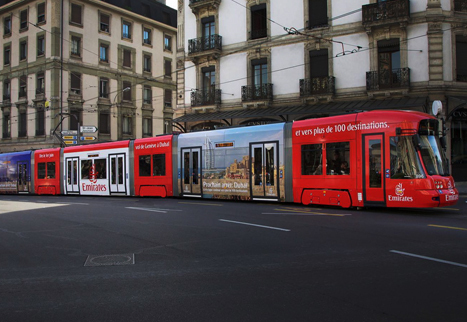
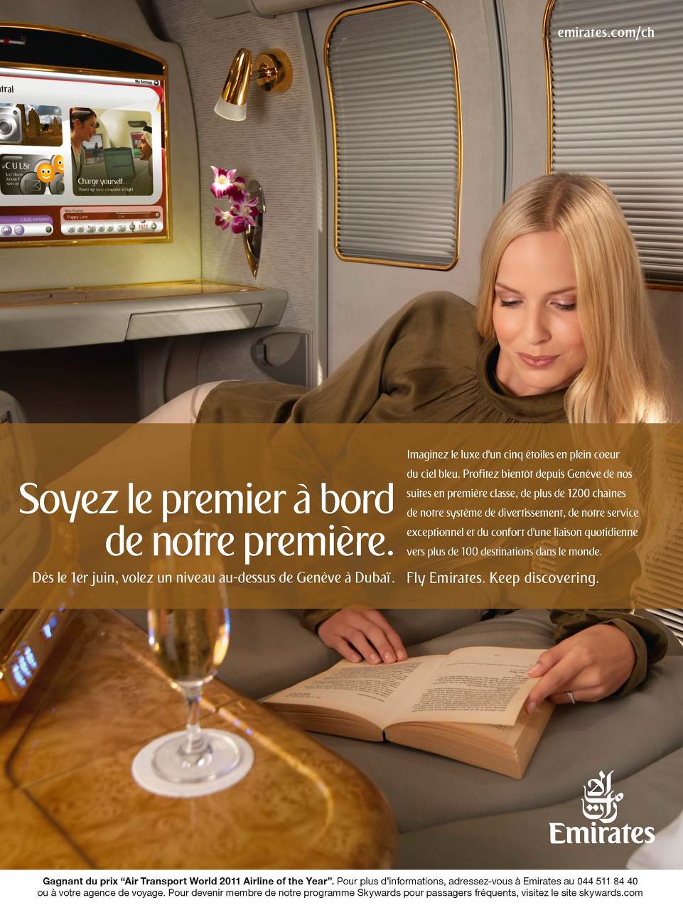
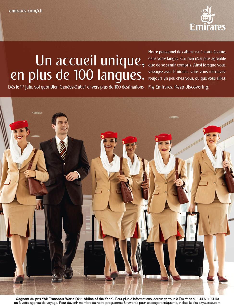
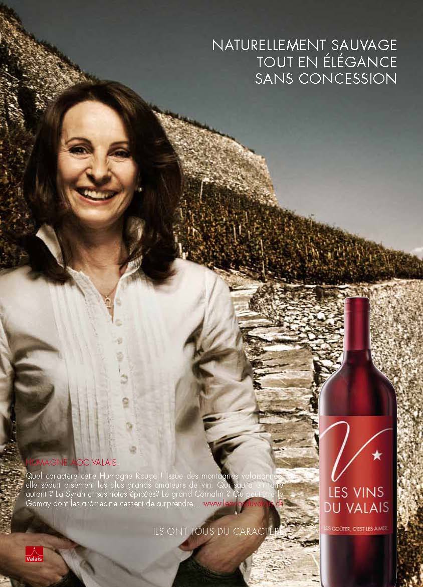
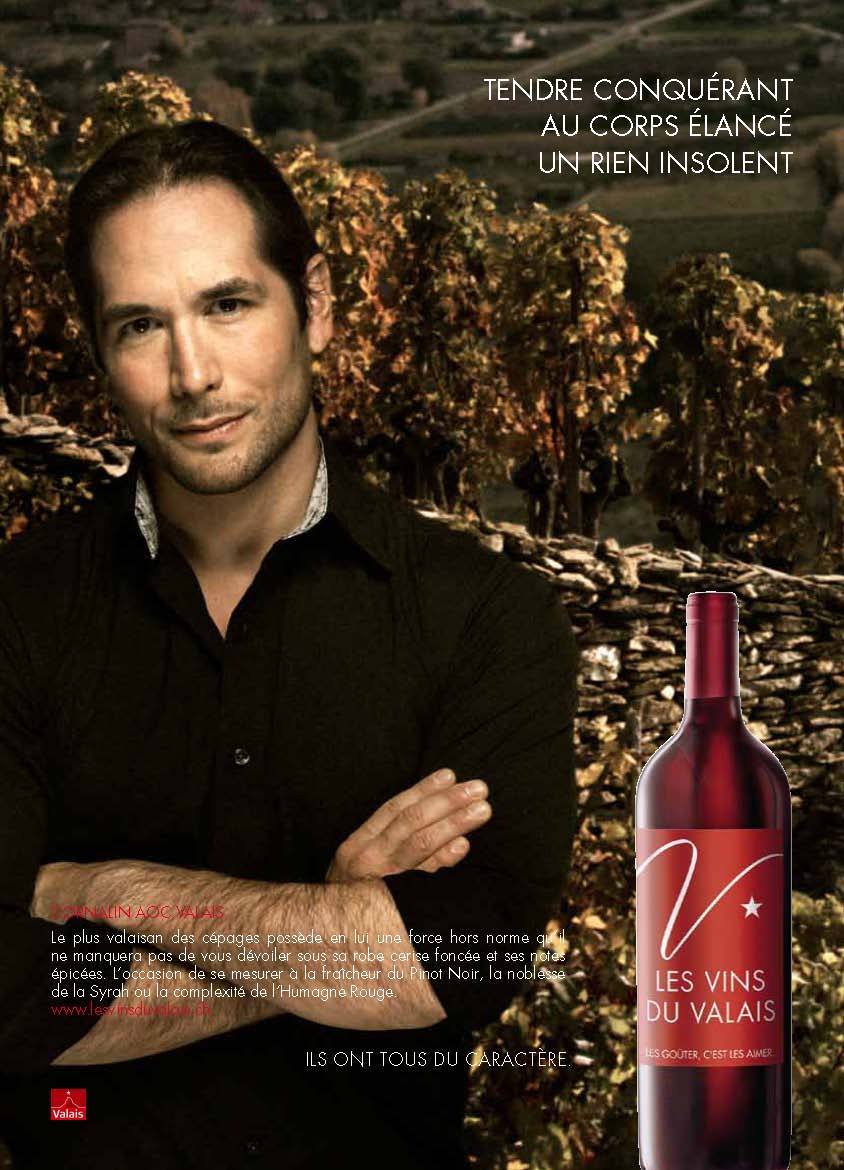
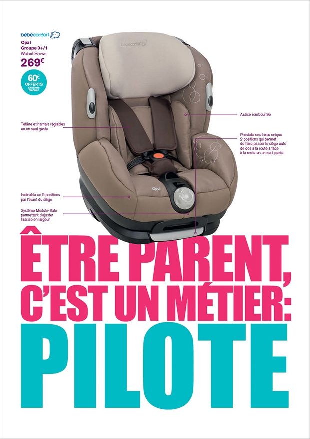
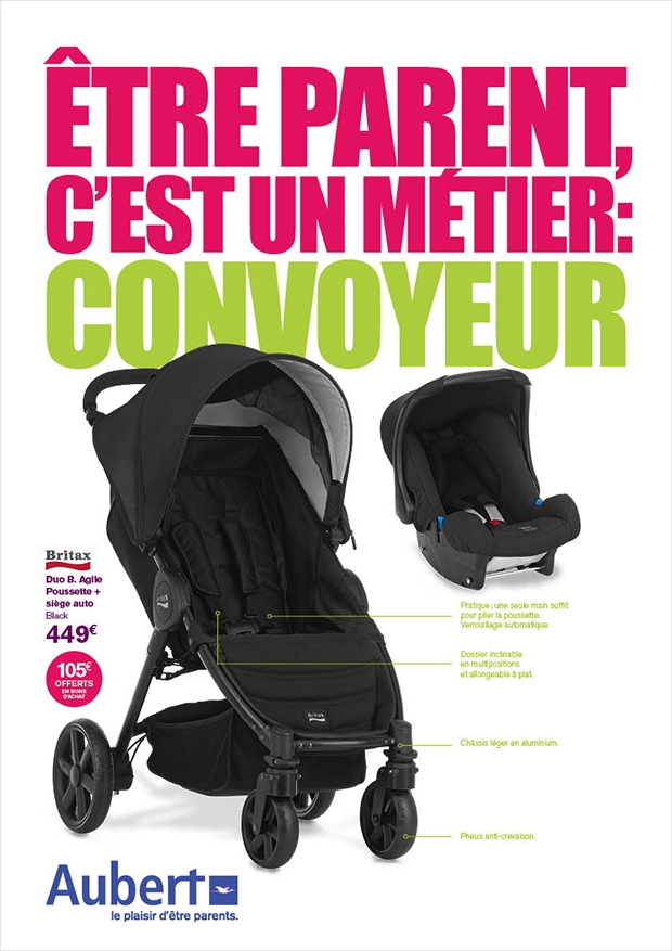
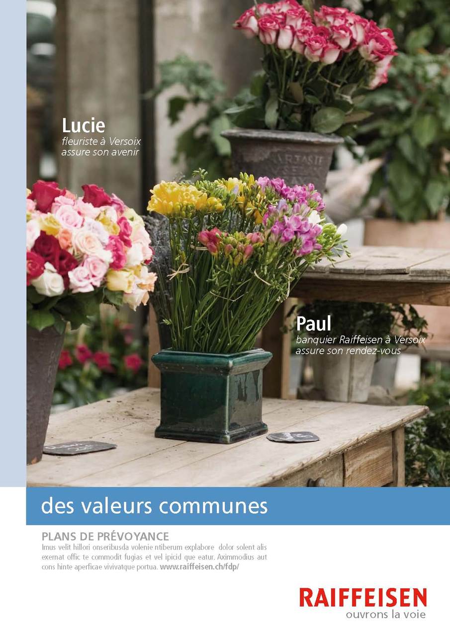
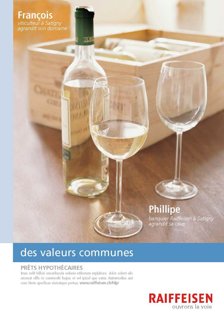
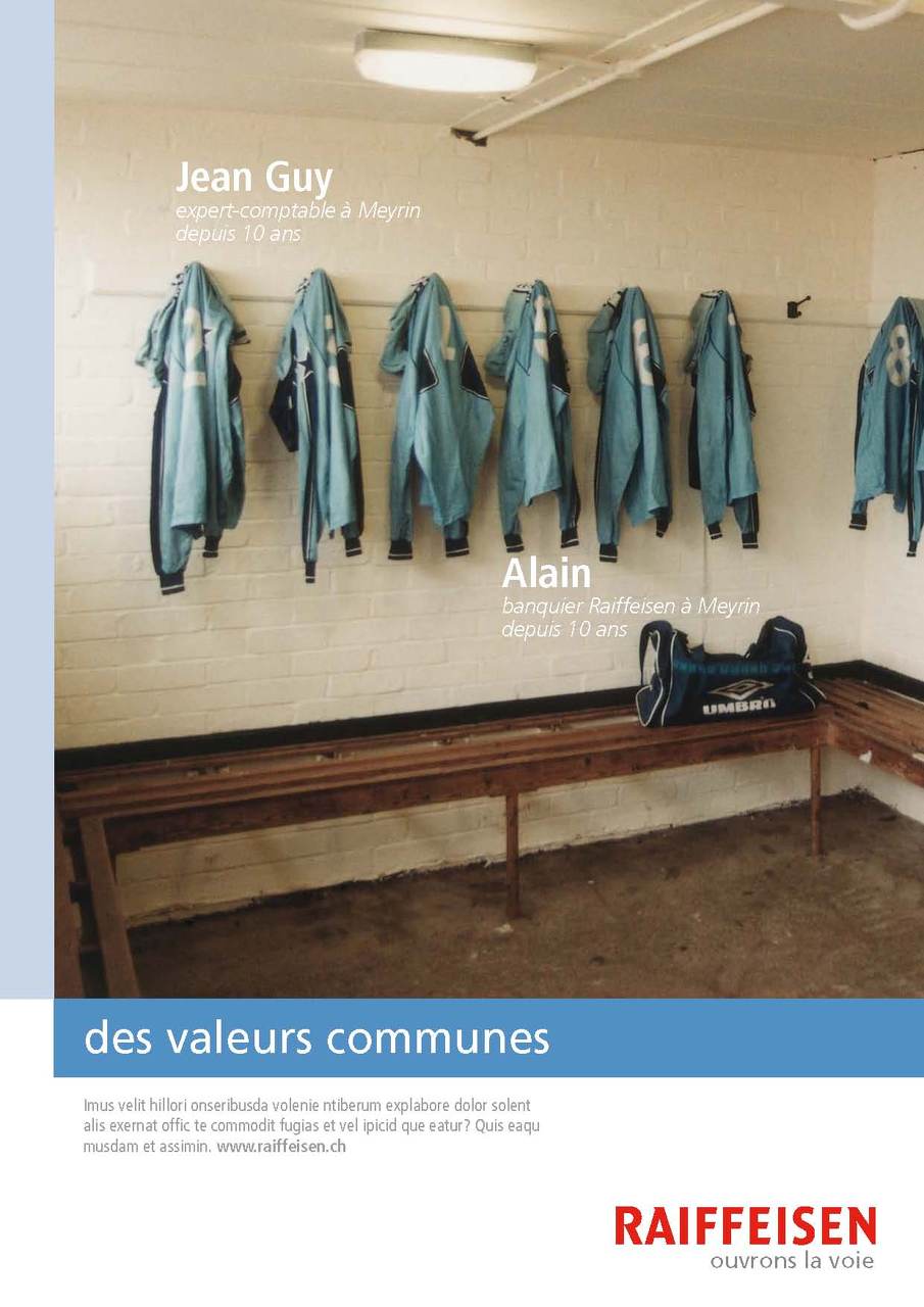
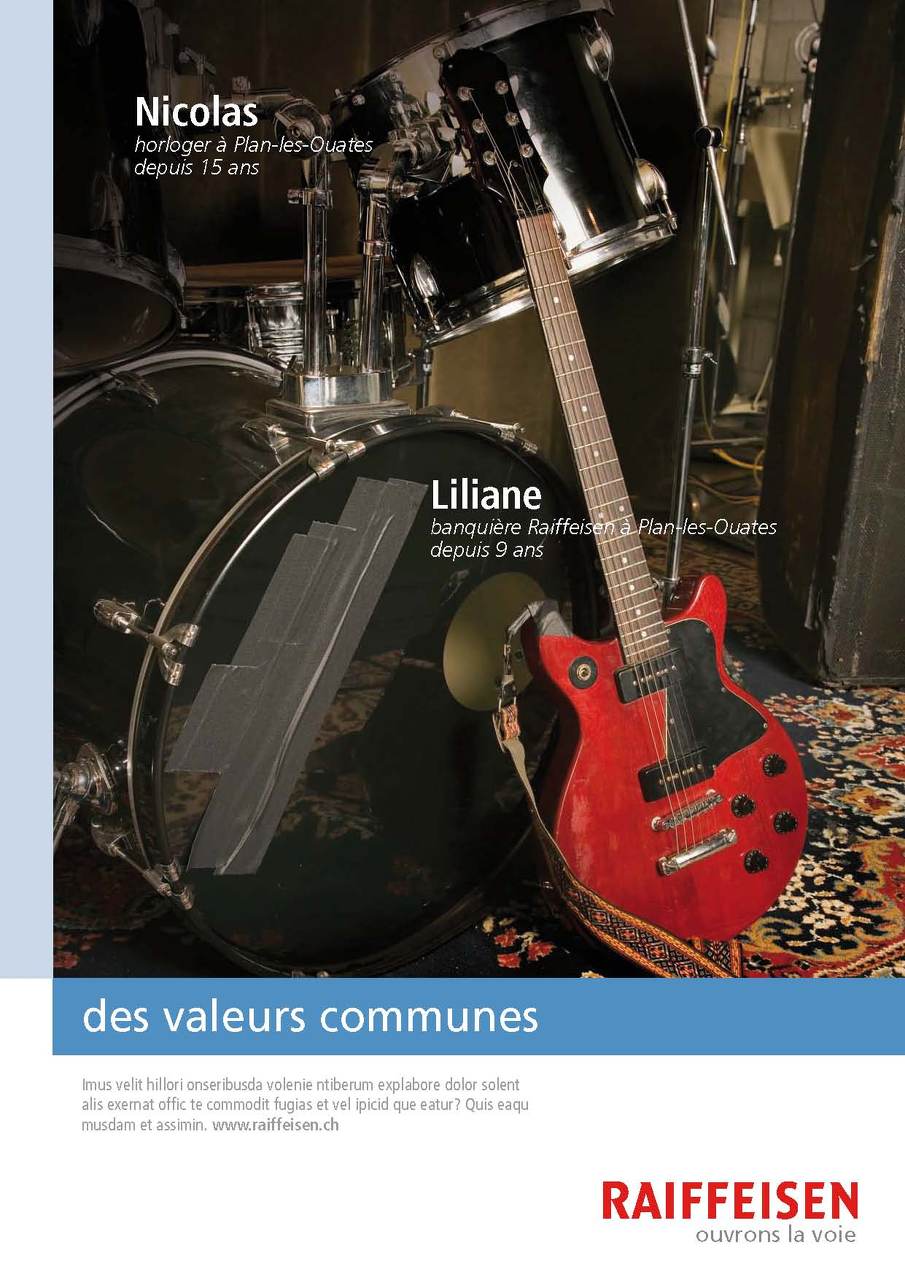
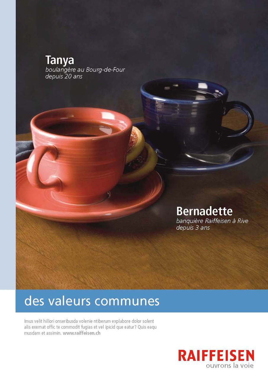
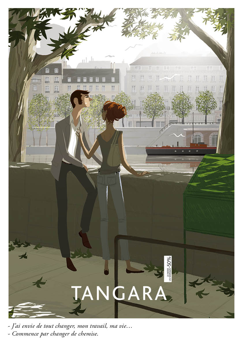
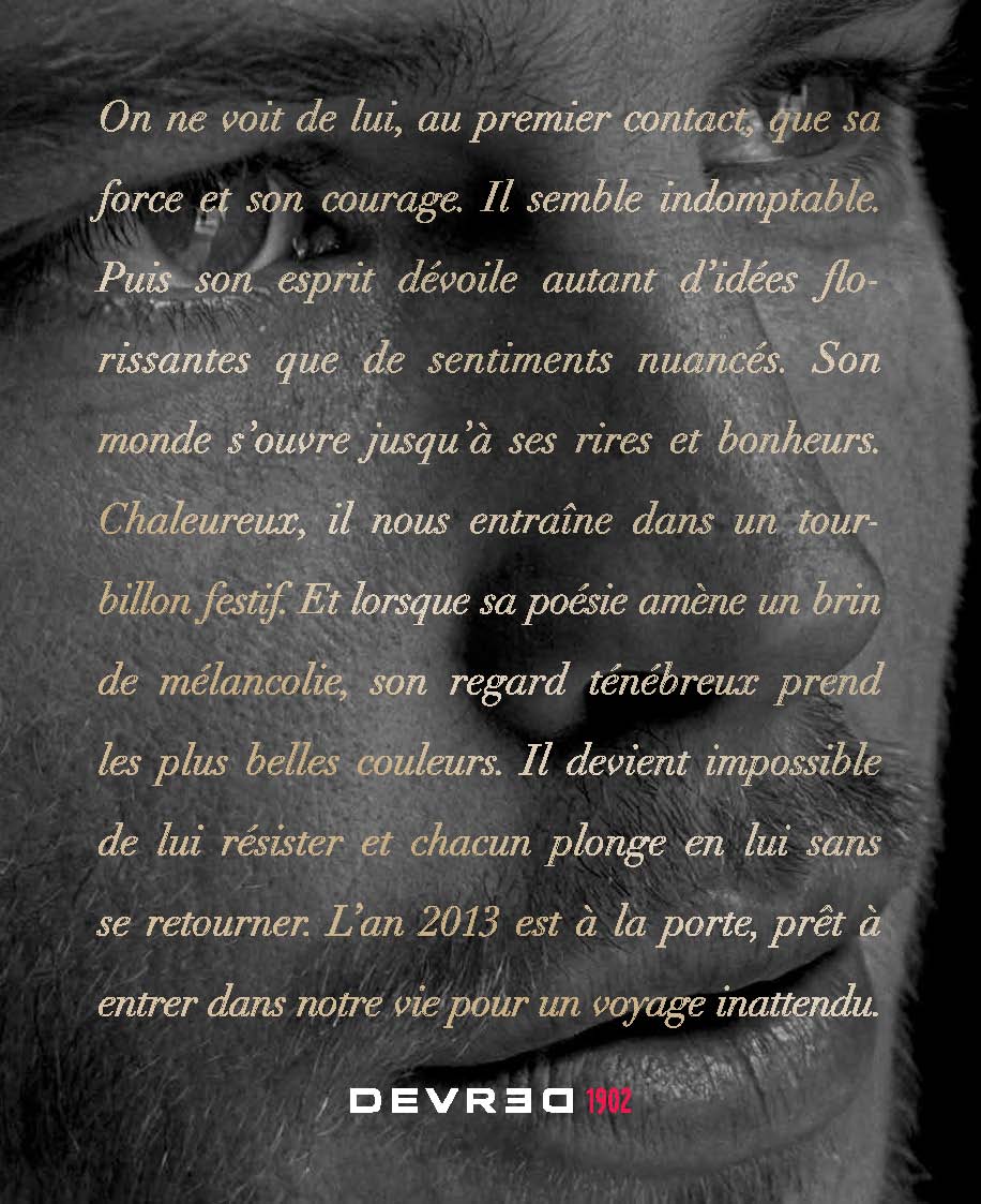
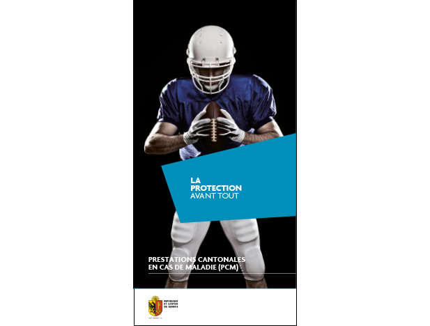
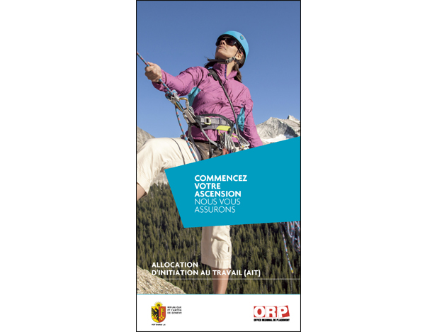
Before UX, there was advertising.
I spent several years as an Art Director and Copywriter at McCann Erickson, Saatchi & Saatchi, M&C Saatchi, and Gaultier Colette; crafting campaigns across print, digital, and brand identity. These are some traces of that life.




Welcome to my portfolio
You're now inside my OS. Make yourself at home: click the icons on the desktop to open my projects, drag the windows around and browse through my work at your own pace.

